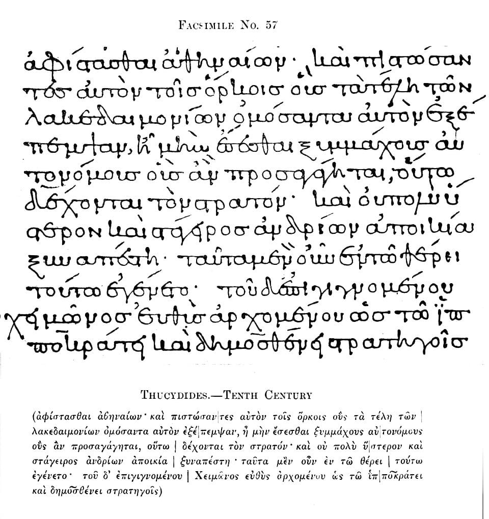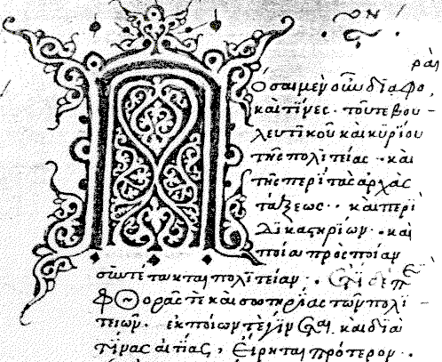
Greek minuscule is a style of Greek handwriting that emerged around the 9th century AD in the heart of the Byzantine world.
While it may seem a minor moment in the long history of the Greek language, Greek minuscule had far-reaching impact. It fundamentally transformed the rhythm and practice of reading and writing in Greek, serving as a bridge between the classical and medieval worlds with a single, elegant stroke of the pen.
The origins of the Greek minuscule writing style

Greek minuscule emerged in the scriptoria of Constantinople and the quiet monasteries of Mount Athos, introducing a revolutionary approach to writing: speed, economy, and elegance. Where the older uncial script once filled Byzantine manuscripts with large, rounded letters, the new minuscule was smaller, faster, and far easier for scribes to use.
For those who spent long hours copying texts by hand, this innovation made a profound difference. Scribes could fit more text on each page, work more efficiently, and preserve a far greater collection of Greek manuscripts—many of which might otherwise have been lost. The Greek minuscule thus became a silent yet transformative force, safeguarding ancient knowledge while shaping the evolution of modern Greek script.
This new style grew out of two distinct traditions: the informal cursive employed in daily administration and the solemn uncial script used to reproduce and disseminate religious, philosophical, and scientific texts. Nestled between bureaucracy and theology, Greek minuscule combined practicality with refinement. Its development coincided with the Macedonian Renaissance, when Byzantine scholars sought to revive the intellectual glory of Classical Greece. The smaller, connected letters and flowing ligatures of minuscule allowed scribes to copy works by Homer, Plato, and Aristotle with unprecedented efficiency, aiding their transmission across generations.
Early manuscripts in Greek minuscule reveal attention to detail not only to function but also to aesthetic form. The letters were fluid and dynamic, looping and leaning across the page. Each manuscript was a subtle masterpiece, and one can almost envision a monk’s hand hovering reverently over the text, carefully reproducing words once spoken in the schools of ancient Athens.

From Greek minuscule to today
The influence of Greek minuscule extended far beyond monastery walls. With the arrival of printing in the 15th century, Renaissance typographers drew inspiration from the elegance of Byzantine handwriting. Aldus Manutius, the Venetian printer celebrated for his Greek editions, based his typefaces directly on these medieval scripts. In this way, every printed Greek book that followed retained the fundamental characteristics established by those early scribes.
Greek minuscule also made its way westward through scholars who studied in Byzantium or transported manuscripts back to Italy and France. These invaluable texts became seeds of the Renaissance, a period when long-lost Classical wisdom was revived. It is no exaggeration to say that the very concept of “Classical continuity” in Europe owes much to the scribes who, centuries earlier, perfected this modest yet profoundly influential script.
Languages naturally evolve, and modern Greek script is different, but studying Greek minuscule today opens a window into a world where art, intellect, and medieval beauty converge. Each manuscript carries the distinct imprint of its maker. Paleographers can trace the idiosyncrasies of a single scribe, identify a region or century from the curves and flourishes, and even reconstruct networks of learning from a handful of pages. These manuscripts are living testaments to the skill, care, and enduring influence of Byzantine scribes.

The differences with modern Greek writing
Greek minuscule and modern Greek writing differ both in appearance and purpose, though the latter clearly reflects the influence of Byzantine script. Minuscule was known for its small, connected letters and frequent use of ligatures—curved strokes joining letters to allow faster writing and a visually pleasing flow. This elegant style was primarily employed by scribes copying religious and classical texts by hand.
By contrast, modern Greek writing, standardized in the 20th century following the introduction of printing, relies on clearly separated, printed letterforms akin to today’s Greek alphabet. It deliberately avoids the elaborate connections and flourishes of minuscule, prioritizing legibility, uniformity, and ease of reading in print and digital media. The shift from intricate penmanship to standardized letters reflects a broader move toward practical communication rather than aesthetic display.
In many respects, Greek minuscule can be regarded as an ancestor of modern cursive. Its flowing, connected forms influenced later handwriting traditions across Europe. Yet in contemporary Greek education, cursive is no longer taught. Students focus on writing neat, separate letters rather than continuous strokes—a shift from the artistry of Byzantine manuscripts to functional modern script. This trend mirrors developments elsewhere, such as in the United States, where cursive instruction has largely disappeared, surviving only in select states or private schools that seek to preserve traditional handwriting practices.


